|
The next thing we started to work on was various perspectives. I had never really worked with much perspective and did not like it at first, but perspective is important in creating compositions and I love how diverse it can be. I am looking forward to the project we will be working on using perspective. 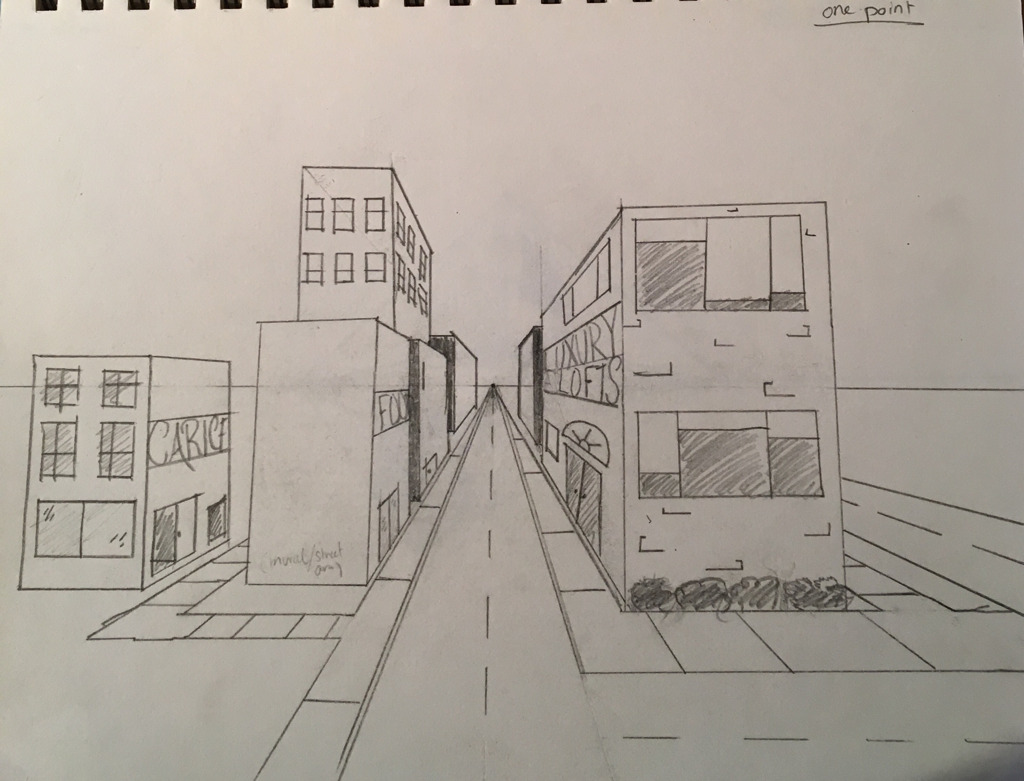 One Point Perspective I enjoyed learning how to create something using one point perspective, I don't believe perspective is one of my strong suits, but I enjoy seeing how all of the vertical lines go to the vanishing point and what it does at varying distances from the vanishing point. 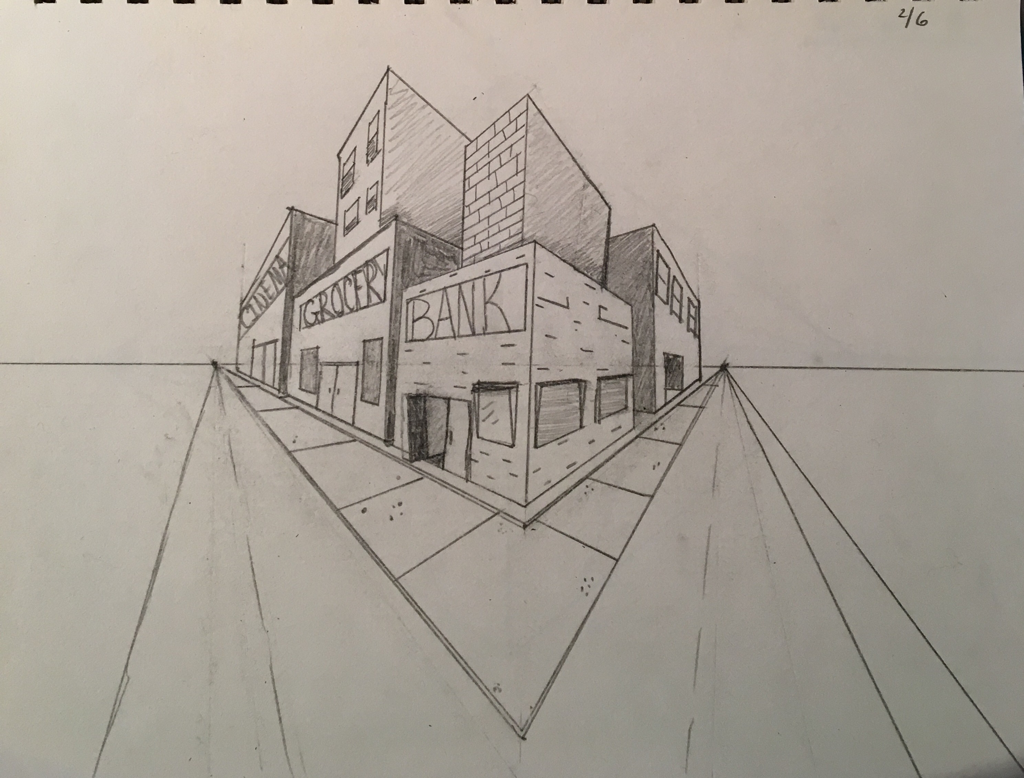 Two Point Perspective The next day, we learned how to draw using two point perspective. We are using city scenes to demonstrate the different perspective and learn which directions are supposed to go on which side of the building or window, which can become confusing. 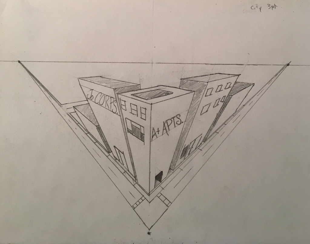 Three Point Perspective The last perspective we learned was three point. This has three vanishing points as opposed to one or two. It is useful in creating a bird's eye view or and ant's eye view of something. I found this one more challenging than the others were, but it is satisfying to look at when finished. 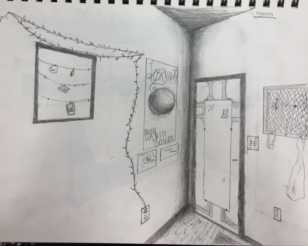 Corner of a Room Perspective
The last perspective practice we worked on was a corner of the room. It was a little difficult since I had to remember that the horizontal lines match up with the vanishing point on the opposite side of the composition. Since I was absent that day, I decided to draw one of the corners in my bedroom.
0 Comments
Our first assignment was an assessment to see where we were at before starting the class. We had to sketch a tree in a landscape, an animal, city scene, and a hand. It was a good refresh of what I had learned in Art 1, but very rusty. 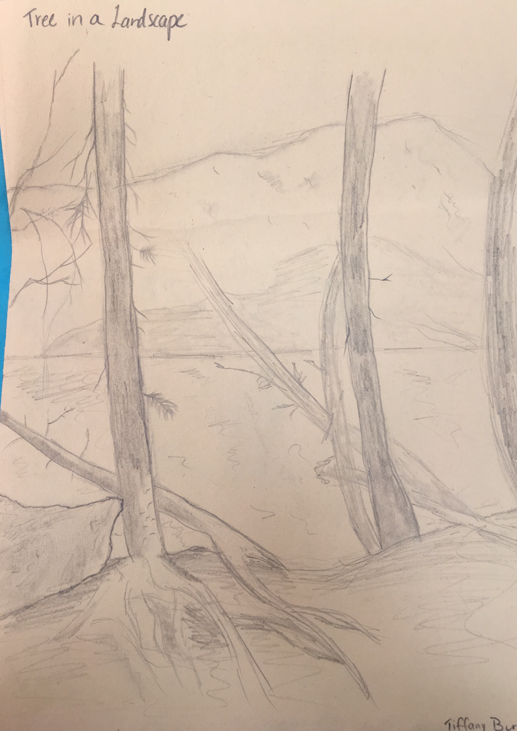 Tree in a Landscape This was the first assessment drawing we did. I used a reference picture and decided to have multiple trees by a lake rather than focus on one. It had been a year or so since last time I sketched anything, so these assessment drawings were tough for me. 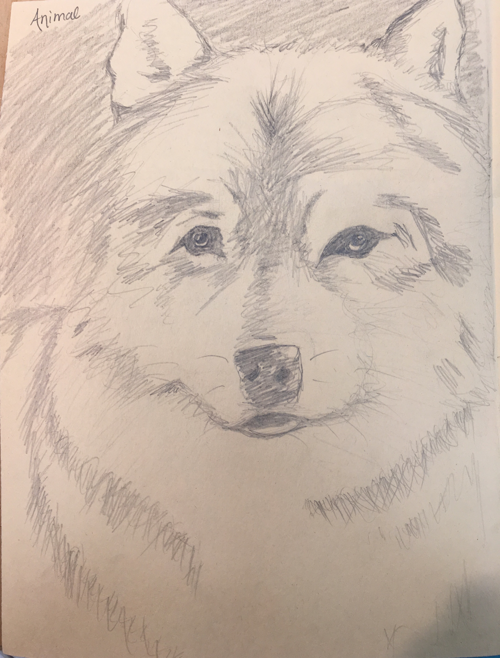 Animal The next picture we had to sketch was of an animal. I found a reference picture of a wolf and decided to use it because I liked the texture of the fur even though I could have done a much better job demonstrating it. 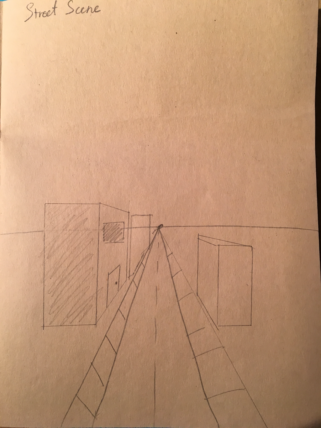 Street Scene with Perspective This was the most challenging assessment drawing for me. I feel very uncomfortable and unfamiliar with Perspective and I do not enjoy using a ruler for all of the lines and edges of things. 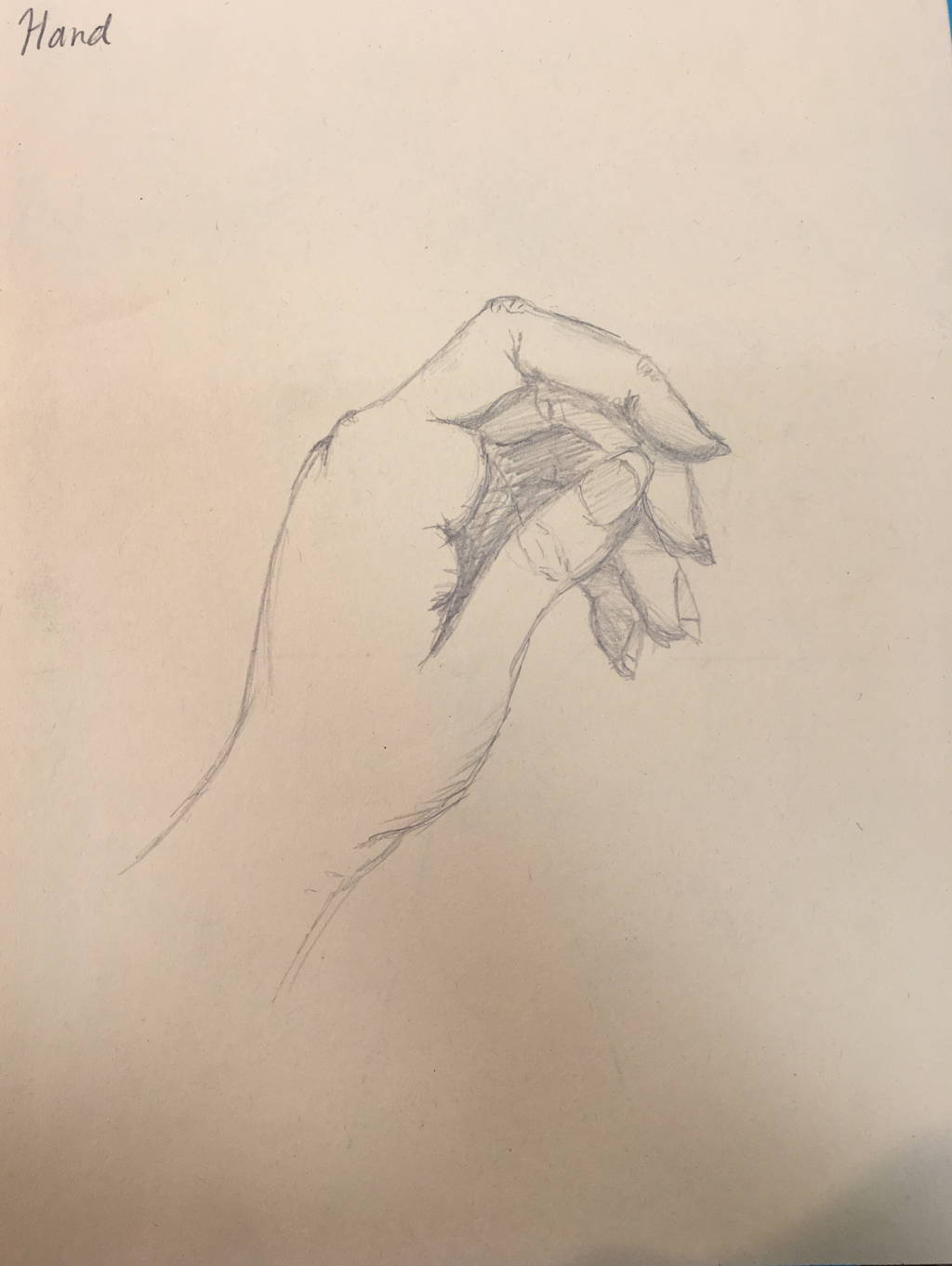 Hand
The final assessment drawing we had to do was of a hand. I used my own as a reference. This was my favorite one to draw, I really enjoy drawing hands and would like to become more familiar with drawing portraits and anatomy. Spending time adding value to compositions is like therapy to me,m. For some reason I just enjoy it quite a lot. I wish I had room in my schedule to have taken Drawing, but hopefully I'll be able to take a drawing class in college. I would love to work more with realism and value using different techniques. 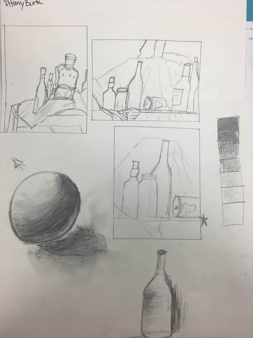 The above photograph shows a series of compositional sketches to explore which would be the best fit for the final still life project as well as a review of value. We used a viewfinder in order to get a better, upclose, picture of possible project ideas. 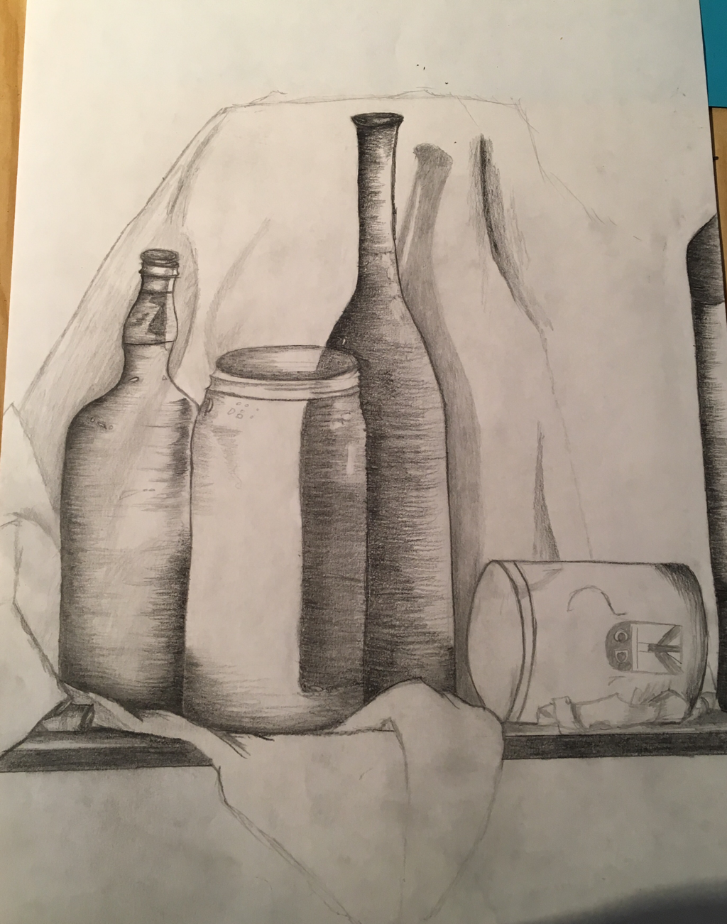 Here, I was just starting to explore the use of value and I was focusing on making the bottles and fabric relative to each other using size and shape. 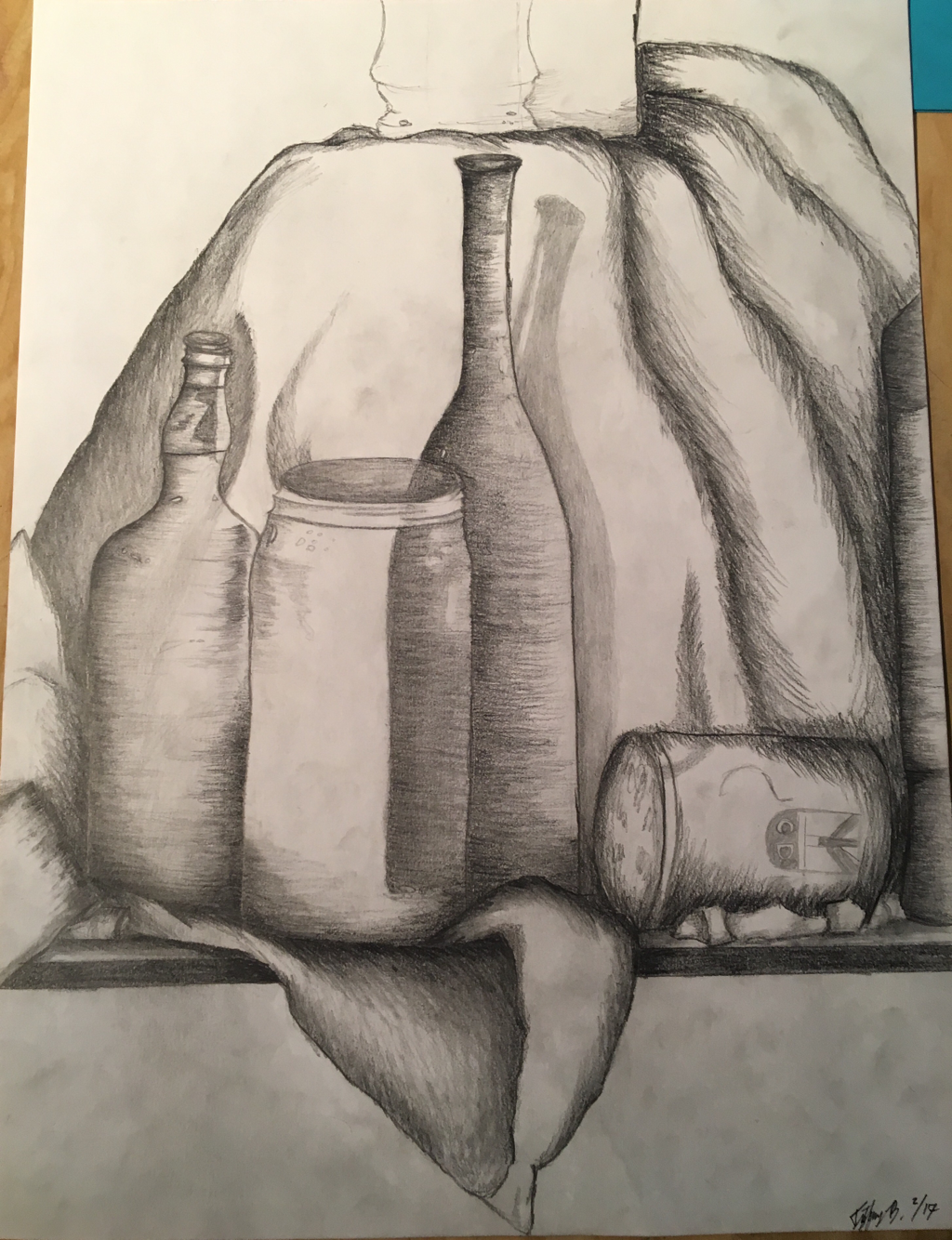 In the above progress photograph, I had started to use a wider variety of values and I had tried to incorporate differing textures in the fabric and using a smoother technique with the bottles. I think the most challenging part of this was creating depth and texture in the fabric. Still Life Final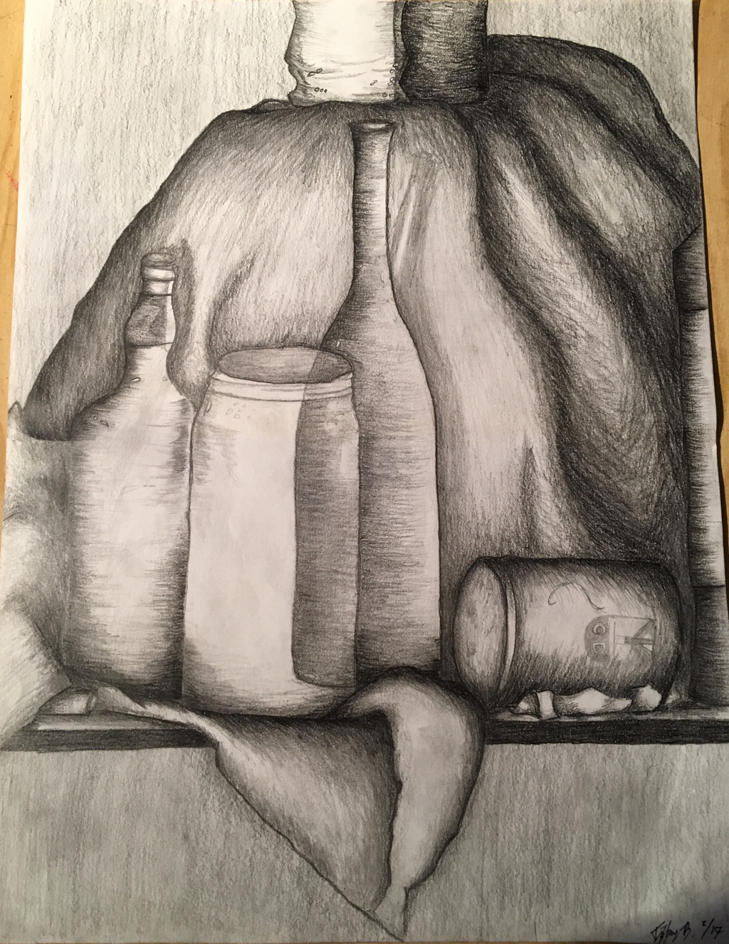 Self-Evaluation:
1. I arranged my still life composition so that the center of focus are the two glass bottles in the center. I made sure that nothing is dead-center and I had some of the bottles around the edges go off the page. I believe that it was relatively successful. There are definitely things that I would have done differently or would like to have changed, but I think there are some good elements in it. 2. Yes, I used the whole range of values from white to black. It is noticeable in the darkest crevices and the near-transparent mason jar glass. I did my best to make full use of the set of weighted pencils and the various weights make a huge difference rather than just using a No. 2 pencil. 3. The practice studies with value were a great review from Art 1 and became a handy scale to look on when comparing values from light to dark. It makes a large difference when creating depth and trying to make objects look realistic on paper. The differing values help make distinctions between the different bottles and fabric as well as creating depth. 4. Using value to create the edges and lines of the fabric and bottles makes them stand out more and look realistic. The amount of pressure that is put through the pencil and transferred onto the paper is key in determining how dark and defined someone wants the lines and shading to be. It is ideal to have very smooth transitions between light and dark values, which I believe to have done well with even though there is plenty of room for improvement. 5. The style used to draw the fabric and glasses is very important. They should be different, since they are different objects. I used a smoother transition and technique for the various glasses to show that they have a smooth surface. For the fabric I used a more haphazard technique that did not have as clean shading and lines. It helped create contrast and definition between the different objects. 6. If I could recreate this piece, I would like to use a wider range of value and explore different techniques with textures, especially concerning the fabric. I would try to make the transitions between the different values smoother and more dynamic as well. |
